Showing posts with label Home Styling. Show all posts

Sunday, March 8, 2015

Put Your Home on a Diet

Having trouble attracting buyers? Maybe it's time to go on a diet.

Homes that languish on the real estate market rarely do so because of a lack of buyers. Generally there is an underlying reason certain homes are consistently dismissed by buyers. Sometimes it is an issue of poor maintenance, other times its bad location. Our experience though has shown that most properties stagnate on the market because they are too heavy.

A home can be too heavy in lots of ways. When every room is painted in a different and very saturated paint color, the home is too heavy with paint. The same is true for wallpaper. Tons of different papers throughout a home can cause it to be too heavy in pattern. Big, overstuffed, and excessive furniture results in a room that seems too heavy with stuff. And when books, papers, cleaners, toiletries, collections, and personal items cover surfaces throughout a home, the space is made heavy with clutter.

Take a look at these heavy rooms:

Room is heavy with super saturated paint & upholstery colors, big, oversized furniture, and tons of knick knacks.
 
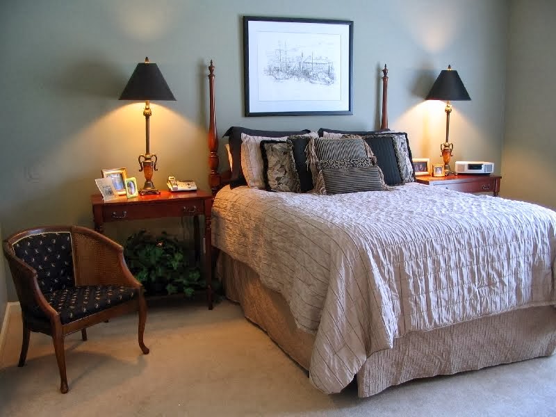
This room is heavy with a large furniture item that doesn't fit the shape of the room
 
This small room is heavy with excessive patterns, and clutter.
 
Room is heavy with saturated paint and large elements (the plant) that chop up the space.

Putting your home on a diet could be the key to sparking buyer interest in a sluggish listing. With really very little effort, a slow listing can become a sleek show stopper. Reducing excessive large furniture items, removing abundant patterns, getting rid of clutter, and improving lighting are all easy-to-do things that can transform your listing from blah to SOLD in no time. Take a look at these "after" photos of rooms that went on a diet.

Room was lightened by removing excessive items (coffee table, patterned throws, & clutter) and adding better lighting. The look was further improved by altering the furniture arrangement. Pieces now fit the scale of the room.

Room was improved by removing the oddly shaped desk and excessive clutter. A more spacious and airy feel was created thanks to the white curtains and open blinds.

Although some pattern remains, the room was improved by significantly reducing visual clutter & excessive patterns.
The room also benefited from improved furniture placement.  

Room has lighter and open feel because the dark saturated paint was replaced with a neutral color. Items blocking the space were also eliminated. Light elements were improved by opening the blinds and adding a light-reflecting mirror.

If you need help putting your home on a diet, contact Bradford House Consulting today! We can help you lighten up interior spaces and turn your home in to a sleek, sophisticated space guaranteed to wow potential buyers.


Friday, January 10, 2014

Let There Be Light!

Whether you're a believer or not, pretty much everyone knows the story of God creating the heavens and earth. And that on the first day, God's very first order of business was to turn on the lights.

"And God said, “Let there be light,” and there was light.
God saw that the light was good . . ." (Genesis 1:3-4)

I happen to be a believer.  But even if I weren't, I'd still be convinced that Light Is Good -- particularly when it comes to selling a house.

Over the summer we were asked to consult on a home that had been on the market several months. It had been shown 35 times without so much as a nibble. The agent and client could not understand why the home had been on the market so long. And after viewing the online photos, we couldn't see the problem either. It was a fairly new home, all brick, great neighborhood, excellent schools, clean, neat, etc. It wasn't over-priced or strangely decorated. It was a truly great home.

The agent and owner theorized that the lack of granite in the kitchen was prohibiting offers, but we suspected the problem was something that we could not see in the online photos. Bad neighbors, cats, a smoker in the home -- you know, one of those things you hate to tell clients. 

We arrived fully expecting to be assaulted by the stench of cat pee, but there was nothing like that to be found. No eyesores next door, no smokers, nothing. The house was as clean and neat as the photos depicted. We were stumped.

We went room-to-room making minor furniture placement suggestions, but there were just no red flags. The only constant was that we kept saying, "You need more light in here." After about the fourth or fifth room, I asked the owner, "Is this how you show the home? Are the lights on or off when buyers visit?"  Well guess what...the lights were off and the blinds closed! Every time a potential buyer entered the home it was like they were stepping into a dungeon.

You could have knocked the agent over with a feather. I watched her mouth literally fall open, aghast at the fact that her client had been showing the home all summer without a single light on anywhere.

There is a reason why the winter causes people to be down and depressed. The grey and gloomy skies and cold temperatures cause a real condition known as SEASONAL AFFECTIVE DISORDER. It's no different when your home is shut off from light. A lack of light depresses buyers and prevents offers. Because of the lack of light throughout the home, buyers visiting our client's dreary home were essentially hit with temporary seasonal affective disorder.

In the case of our "in the dark" client, we told her to add lamps to every room and turn them on whenever the home was shown. She did and the house sold within a week.

If you're still skeptical, just take a look a the difference lights can make to the overall aesthetic of a room.

No lights, Blinds closed
See how blah that room looks with no lights on and the blinds closed? It's completely cold and dark. Nothing about that makes me want to go in and enjoy the space. Totally uninviting.


Lights on, Blinds open

Here's the same room with the lights on and blinds open. It's brighter, warmer and the beauty of the room shows. You see details in the accessories and the space of the room seems larger.

Lighting can really make a difference in your online photos too. The pictures above are totally amateurish (meaning they were taken by me). A professional photographer is trained how to use lighting to achieve the most beautiful photo possible. It's no secret. Lighting can make or break a first impression -- even online.

So if you do nothing else to prepare to sell your home, PLEASE....let there be light!

Friday, November 29, 2013

Trees, Turkeys, & Twin-size Sheets

Yesterday we hosted the whole family for Thanksgiving dinner. As most anyone who has ever hosted the meal of the year will tell you, there's a ton of prep work required before the first dish hits the table. Chief among the list of to-do's is cleaning. I keep my home fairly clean every day. But when it comes to special occasions, I always want to make things sparkle.

So before we fried three turkeys, baked two dishes of cornbread dressing, and one giant pan of homemade mac & cheese to go with all the other fixings, my husband and I cleaned the house from top to bottom. Steaming carpets, wiping baseboards, washing windows; we had enough stuff on our list to keep us busy for five full days. Despite our long list of chores, with less than 24 hours to Turkey Time, I decided to give our bedroom a mini-makeover.

I'm really terrible about remembering to take "Before" pictures of my own stuff. I always remember when we work with clients, but when it comes to my own projects I regularly drop the ball. Such is the case with my latest project. I had to wade through some really old photos to give you an idea what things looked like before we made changes on Wednesday.

Biggest Bradford pear trees ever!
The first "Before" picture shows the real impetus for this project. You see those giant Bradford pear trees? I had a hate-love relationship with those trees for many years. I hated the way they blocked the view of our home. And I hated the way that no matter how often we pruned them, whenever the slightest wind blew, a branch would usually fall off. Eventually strong winds relieved us of the hassle of regular prunings by taking them both completely down. That's when I discovered that I actually loved those trees because whenever the moon was full, they kept the piercing 3 AM moonlight from shining right into my eyes.

So let's take a look at my bedroom -- or at least what my bedroom looked like a few years ago.

BEFORE - celery green walls, ornate bedding, sad little chair.
A year or so after the previous picture was made, we upgraded to a king-sized bed which required a new headboard, bedding, etc. I showed a glimpse of the new bed when I discussed how to properly make a bed. Here's how it looked just a few days ago . . .

King size bed w/dark frame & microfiber upholstered headboard
Now to the "AFTER" photos . . . Before you take a look, I need to reiterate that this is a mini-makeover. There is still plenty of changes to come like new lamps, art, and more. For now though, here's a look at phase one -- all accomplished on the Wednesday night before Thanksgiving.

Bedroom AFTER (Phase I)
First, we got rid of those celery green walls (Okay, I didn't do this step on Wednesday. That was done a few months ago). Next we painted, glazed, and distressed the headboard. Then we reupholstered it with a simple grey on white plaid fabric.

After upholstering the headboard, I had a little bit of fabric left. In fact, it was just enough to cover that sad little bedside chair. Looks a lot better now, huh?

Then the obvious change of adding simple, white bedding. So simple, but so impactful.

Then we attacked the primary problem of my bedroom -- covering that arched window that lets the full moon blind us on a monthly basis. Our ceilings are pretty tall (10 ft), so we needed extra long curtains. With the crown molding, we needed 110" panels to be exact. The problem though is that with less than 24 hours, finding ready-made 110" panels is next to impossible. So we opted for a pair of XL Twin-size flat bed sheets hung from cafe clips. And when the moon is full, you can bet we'll slide those bad boys across that arch and sleep like babies for the first time since the trees fell.


I'm really thankful that Grady approves of the changes. Nothing is worse than a grumpy schnauzer during the holidays!

Wednesday, February 20, 2013

Sectioned Off

If there is one piece of furniture that makes me cringe nearly every time I see it in a home, it has to be the sectional sofa. Not EVERY time; just nearly every time.

My issue with the sectional sofa is two-fold. First, I have a problem with its design. The big selling point of the sectional is its spaciousness and comfort. People shopping for sectionals are always saying things like, "Just look how much more seating we'll have."  Don't fall for it. Unless you are buying an oval sectional, you will actually lose more comfortable seating capacity than you'd gain with a basic sofa and love seat combo.

Not as big as you think
Take a look at the picture above. That sofa touts seating for five. In reality it only seats four; just three, comfortably. No one wants to sit in the corner of that sofa. And if they do end up as the unlucky one stuck in the corner, they'd better be 6'4" or more, otherwise their feet will not reach the floor. There's also the problem of two people sitting simultaneously in the seats adjacent to the corner. Their knees will inevitably knock into one another. I don't know about you, but the thought of knocking knees with a new acquaintance during cocktail hour sounds pretty uncomfortable to me.

Room too small for sectional
The second issue I have with popular sectional seating is scale. Issues of scale, however, aren't totally the fault of furniture manufacturers. We are the ones who keep buying the bulky, oversized, overstuffed monstrosities that manufacturers try to pass off as sofas. Then we schlep 'em home and stuff the behemoths into rooms only big enough for a pair of club chairs.

It sounds like I am anti-sectional. I am really not. I just believe that too many folks are buying sectionals without really giving the plan a thorough vetting. Sectionals can actually be very useful. They are terrific for visually partitioning off conversation areas in large rooms. In the picture below, you can see the rest of the room where the sectional above was once located.

Long, narrow room; not suited for a massive sectional at the entry
The room is long and narrow. Too narrow, in fact, for the large puffy sectional that is in it. You can also see that the room is serving as both a media/entertainment center and an office. Using a sectional to separate the various room functions is a good idea, but the scale and arrangement of that particular sectional is not good for the space. The long part that should divide the room is on the wrong side, up against the wall. With the right size and shaped sectional, the room could be a show stopper.

Here is an example of a sectional done right. It is a studio apartment where a sectional is used for separating the conversation/living space from the sleeping area. Notice how it properly divides the room. It is flanked by a tall, open bookcase to further delineate the space without closing it in. This is an EXCELLENT example of great scale and use of a sectional sofa. Wouldn't the space above have been great with a similar design?

Great use of a sectional. Serves both form and function.

Bottom line is you need to really think about the size of your room, how much comfortable seating you actually need, and the room's function & style before you head out furniture shopping. Ask yourself if you really need a sectional, can your room hold a sectional, or could a sofa and loveseat work just as well? And remember: Measure twice, buy once. 

Sunday, April 1, 2012

Dressing Up the Dressing Room

Once again we had the task of styling on a minuscule budget. Actually it was a zero budget project. So, if the owner did not already have it, then we had to do without; plain and simple.

One particular area of this style-to-sell project desperately in need of some dressing up was the condo's dressing room and bath. As I said, we had no budget for renovations. We could only play-up the space's possibilities with accessories.

To say we were working with the bare bones was an understatement. The area was EMPTY! Even so, we determined right away that the overhead shelf was space that we wanted to show off to buyers because of all the extra vertical storage it provided.


As you can see, accessories are key to making a space come to life. Well placed and coordinated accessories have the ability to make a small space seem so much larger. The use of natural fibers and complimentary colors were inspired by the gorgeous color variations in the marble countertops . . .


Another thing we did to dress up the space was to add a touch of drama to the large shower. Rather than use a plain old shower curtain, we added a pair of grommeted drapery panels to frame the shower area. Drapery panels offer more style and accentuate ceiling height so much better than a traditional shower curtain hung at the usual height of 6'.

Finally, with some satin ribbon and raffia borrowed from the craft closet, we added a touch of flair to the towel bar and, in the process, tied together the entire look.


Monday, March 26, 2012

Past Projects

We've got a lot of small projects underway at the moment, but no photos yet. Sorry.

I promise that by next week we will have at least one great before-and-after inspiration project that almost ANYONE can do. I can't wait to show it off. I have high hopes for this one.

Until then, we thought the new blog might be a great opportunity to show off some photos from past projects. Enjoy -- while we go finish up those current projects.

Project 1 -- Dining Room Spruce-Up


Fresh potted orchids in antique planter, new accessories, powerful artwork,
coordinating place settings and lots of ambient light make this dining room a hit!


Project 2 -- Big Space Made Cozy


A cozy conversation area is created by adding new club chairs in this oversized family room.


Project 3 -- A Great Remodel

This project was the renovation and addition of space to a small, choppy floor plan. We started by transforming the existing great room into a new dining room space suitable for the large family that often gathers here.


We were fortunate that the owner had great furnishings
along with an amazing collection of antique pottery, art, and chinoiserie.


A dining room fireplace is a feature not typically found in new construction.
We believe the unusual amenity adds character reminiscent of traditional southern homes.


The tiny old dining room presented quite a space planning obstacle for the owners.
"What do you do in here?" was a question we frequently pondered.
Now the space is a high-functioning multipurpose room.
It does double-duty as a writing/work area on most days,
but quickly transforms into a gorgeous buffet table and extra seating for parties. 


An addition of space was made to the existing floor plan at the rear of the home.
A 24'x20' Great Room was added to give the homeowners a more livable, open, and inviting area to live and entertain. 
Neutral wall colors and plantation shutters add to the light and airy feel of the space.


The new space features a cohesive, but eclectic mix of furniture and accessories,
ambient lighting, tray ceilings, recessed lighting, surround sound,
and artwork created by the owner.


Project 4: Kids' Kingdom


The transition from little kid to young adult can present lots of decorating challenges.
This room is a great example for addressing that dilemma.
Who knew army green fatigues and dress khakis could provide such
incredible inspiration for home interiors?