
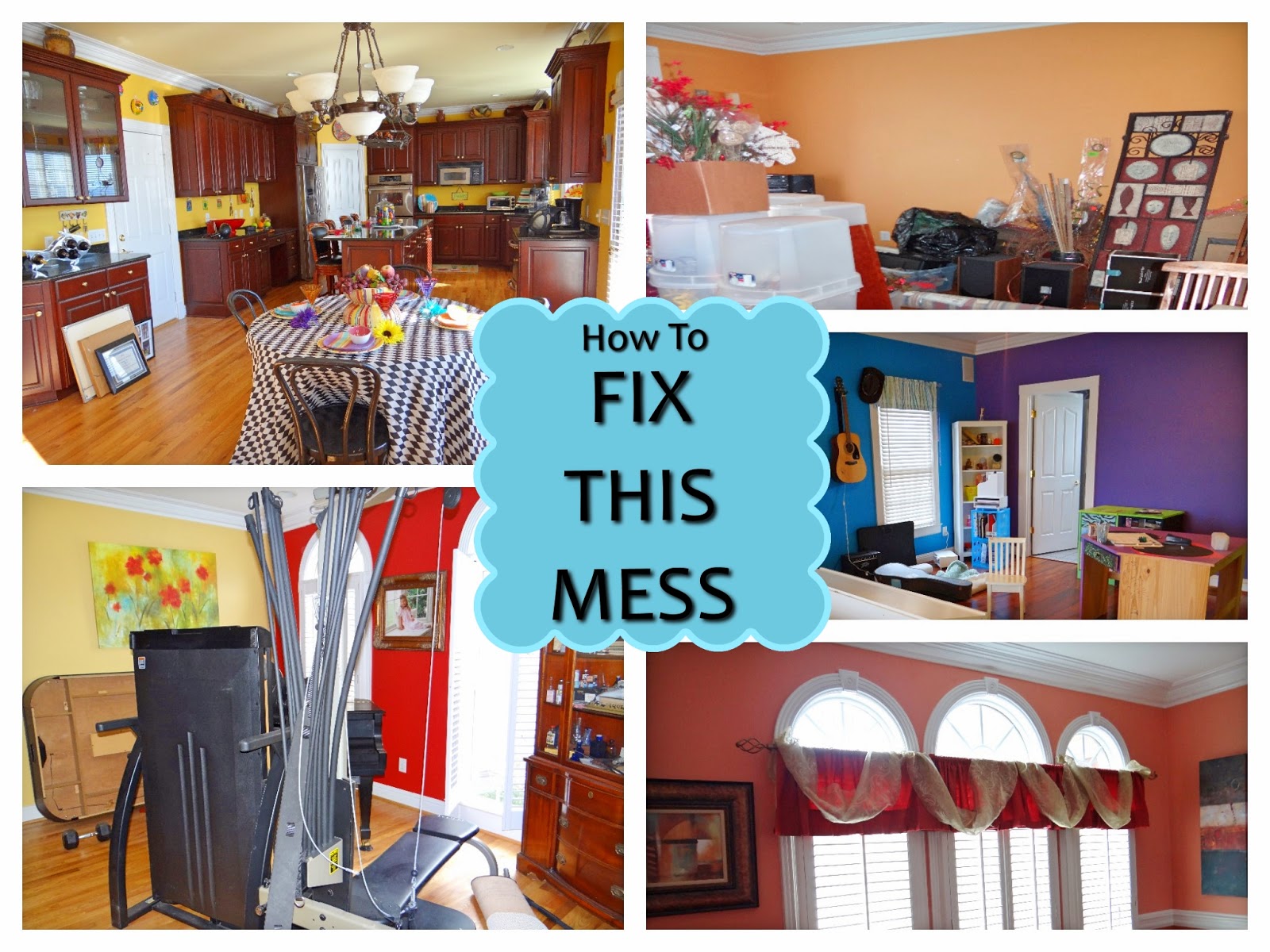
So here's the deal: The owners built another home nearby and moved into it months ago. Their new home is completely furnished and decorated. All the stuff remaining in this "vacant" home is what they didn't need or want in the new home. Some rooms are just as they were the day the family moved out, others are full of boxes and unwanted items.
 |
| Our challenge |
The challenge was to take all that stuff - a hodgepodge of unbelievably bright colors, mismatched furniture, and unusual accessories -- and turn it into a look befitting a million dollar lakefront listing. Did I mention that we had to do so without painting a single wall or adding any staging accessories whatsoever? We said - BRING IT ON!
Our first room to tackle was the kitchen. Essentially, it remained in exactly the same condition as the day they moved out. With uber bright yellow walls and massive amounts of kitsch tacked to every surface, the look just wasn't working. So we removed nearly everything. Then we staged it with only simple, solid colored, and neutral items to counterbalance the strong wall color.


One more thing about the kitchen & breakfast area that I must mention is the tablecloth. Wow! It's something, isn't it? Normally we'd just remove it and move on to the next thing, but in this case that solution wasn't possible. The owners took the kitchen table with them when they left. What you see now is their somewhat clever attempt to disguise a folding table as a kitchen table.

Like I said, our initial thought was to just remove the hotspot altogether, but without the table beneath, the low-hanging chandelier would be a hazard to prospective buyers touring the property. The table had to remain. We scoured every inch of the home seeking an alternative to the harsh harlequin pattern on the tablecloth. The best we could do to neutralize it was to throw a solid café square over it. It's not ideal, but it is certainly easier on the eyes.

Like the kitchen, the living room presented similar issues -- bright colors & lots of knick knacks. We also had to cope with clutter and furniture placement problems. The room itself was also a challenge. Essentially we had a big room, big furniture, but very little wall space. Floating the large sofa between the columns or facing the windows was considered, but we ultimately decided against that option because showing off the space was top priority. In the end, we positioned the recliner near the sofa, offering buyers a fully open living area. Take a look . . .


The dining room was my favorite transformation of the day. First we removed the all of the clutter blocking the entrance to the room and that heavy, light-thieving valance. Next we separated and moved the oddly paired bookcase ends that were hiding the alcove. From there we moved on to decluttering and editing accessories. We also placed all the chairs around the table to eliminate the number of items scattered about the room. But what made the room spring to life was adding that gorgeous piece of statement art under the recessed spotlights in the alcove. The result is amazing!


In this bath, we were once again faced with the unchangeable yellow wall color. Actually the color can be great when the art and accessories work in its favor, but when accessories are in such an abundance that your eyes dart back and forth from accessory to color, it can overwhelm the senses. To make a really saturated wall color work, it is best to let the color be the accessory. Keep everything else soft and simple.


The master bedroom and bath was another of my favorite changes of this project. When we arrived the master suite was a narrow alleyway chopped in half by a dated, and very odd fireplace. Leaving the room empty was NOT an option because you CANT. STOP. STARING. AT. THE. FIREPLACE.

Near the master suite we noticed a very small bedroom that was crammed full of furniture. We decided that it would be far better for a small bedroom to sit empty than the master suite. So we borrowed from the small bedroom to show off the potential of the master.

Take a look at the Master Suite transformation sponsored by a neighboring bedroom . . .


Just as we did in other rooms, we addressed the issue of bright paint and kitsch in the master bath by decluttering, editing, and adding some powerful & coordinated art. The changes make for a much more pleasing appearance.


