Showing posts with label accessories. Show all posts

Thursday, October 27, 2016

New Home, New Challenges

Don't you just love a new home? I can spend an entire day touring one new house after the next; oohing and ahhing over all of the modern amenities. There's just something about a never-used home that grabs hold of a buyer in a way that no other property can.

Finding the right home can be a lot like finding a mate. When things are brand new, they are attractive for sure; but are they right for you? Before you sign on the dotted line, you'd better ask yourself if your furnishings will fit the size and style of the new home. If not, are you prepared to purchase new things? If you cannot answer yes to those questions, then you should probably keep looking.

Last week I had the opportunity to work with a client who just purchased a brand new home. It's gorgeous and I love it, but from a design standpoint -- the great room is a major challenge. I probably run into this same room design at least once a month, either on the staging side or the design side of my business. It never gets easier, no matter how many times I see it. This layout is tough.

For my client, decorating the long, narrow room chock-full of angled walls, oddly placed columns, and a giant breakfast bar, was overwhelming. Fortunately she recognized that she did not already have the right furnishings on hand, so she set aside a budget to make the challenging great room as spectacular as the rest of her new home.

Take a look at where we started . . .


As you can see, the room is long and narrow. That issue is compounded by a breakfast bar, a large angled fireplace, and an oddly placed column -- all of which protrude into the room's usable space.

The first step to getting this room in order was to understand the owner's personal style. We talked about what looks and colors she preferred, her family's lifestyle, and how the room would be used. From those discussions, we determined her style to be transitional and that the color palette should be comprised of soft neutrals and blues, with accents of yellow & gold. She said that her family planned to put the TV in the space above the fireplace, so we would not have to accomodate extra cabinetry or case goods.

The next step was to measure. Measure. Measure. Measure. It's super important; especially when trying to fill a narrow room with lots of seating. Good measuring can also keep you from mistakes like buying a sectional sofa that is way too big for your room. Best of all, you can transfer those measurements to a virtual design program to generate an ideal layout for your room.

When we had our style, color palette, and layout determined, it was time to shop. We focused on classic style, clean lines, neutral colors, and simple patterns for our foundation pieces (sofas, chairs, and rug). Foundation pieces are NOT where you should get trendy. Keep foundations simple and neutral. We settled on a pair of small, three-cushion sofas in a light fabric. Then the rug incorporated the blue palette in a simple, muted pattern.

Then the accessories were added. Working largest to smallest, we found an amazing coffee table and comfortable chair with matching ottoman (which is on order). Then we added side tables, great lamps, pillows, table accessories, and large art. It came together very nicely and the client LOVED it.

We're still waiting on the plantation shutters to be installed and the ottoman to arrive, but you can get a feel for how the room was completely transformed with some basic furniture pieces and great accessories. Take a look . . .


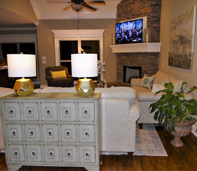


So if you find yourself lusting after a new home, be sure it's the right fit for your furniture and lifestyle. If not, make sure your budget can afford the items needed to make it a home you can love. Otherwise, you could end up with a case of buyer's remorse. 

Tuesday, June 24, 2014

A Home Living Project

Last post I promised lots of before and after photos were on the way. I haven't forgotten. Today, I give you round two of The Summer of Before & After . . .

A warning first: This project is NOT before and after images from a home staging. This is a home living project. A few months ago we helped the homeowner's sell their old home. So when they moved, they asked us to help them create a design plan for their new place.

Creating a space for a client to live in is vastly different than helping them stage a home to sell. Design for living must take into account the homeowner's personal tastes and belongings. Great Aunt Helga's crocheted doily that we made them pack away when the house was on the market is probably going to be on display in the new home. Or bold wall colors that would never fly when selling a house, will now have to be incorporated into the design plan. Essentially, designing for a client long-term involves taking their conglomeration of stuff and personal taste, and finding a way to tie it all together in a pleasing fashion. This project is an example of doing just that . . .

 
We first visited this sweet couple just two days after their move. Things were still in boxes. Nothing was on walls. There was no lamp light. And it was really hard to see the home's potential. What we did notice, though, is that the client had unknowingly established a color palette. The primary color they inadvertently chose was a very deep blue with grey & green undertones. They had also established through upholstery and paint choices the secondary colors of brown and green. So even though things were in total disarray, we had a starting point -- Blue, Brown, and Green.

We gave the couple our thoughts about furniture placement and items they still needed like rugs, bedding, and a pair of club chairs. (Every home should have a matching pair of club chairs!) We also established a budget and list of shopping items that we would source in order to make their existing items come to life in the new home.

Dining BEFORE
In the dining room we started out with their existing, very traditional Thomasville table, chairs, and china cabinet. The client also had a small antique buffet. The mirror was a bit of an afterthought. It was a piece they'd had for years and nearly forgotten. It sort of stood out among the accessory items stored in the garage, just begging to be hung in the dining room. The rug was a purchase we asked them to make before we arrived for the final installation. Look at the detail in the rug. Without realizing it, the homeowners kept choosing the same blue/grey color to establish the color palette.
 
Dining AFTER

To complete the dining room, we purchased a large pair of complementary botanical prints. It's difficult to see in the photo, but the mats in the pictures repeat the colors of the rug. We also added the skinniest pair of buffet lamps we could find in all of Nashville. The size of the buffet and the two-tone mirror dictated the need for skinny, gold lamps. We were thrilled to find those amazing lamps. Up close, the posts look like gold beads. They were the perfect amount of bling to dress up the dining room. Finally, we added a pop of bright berry and green colors to table through a floral arrangement the homeowners already had. With that floral, we reinforced the secondary green color, and added a third secondary color with the berry tone.

In the family room, we tackled one of our most hated obstacles -- THE SECTIONAL SOFA! Our regulars know why we abhor sectionals. If you missed it, you can find out why here.

Family Room BEFORE
Despite our distaste of a sectional sofa, it was staying and we had to deal with it. There was no moving it to a better location. It was in the only place it could fit in the room. Really, the only thing to do was to break up the massive brown span of knobby upholstery -- but how? A RUG and PILLOWS! We lightened and visually separated the gigantic brown "L" with a light rug and pillows in natural tones. Then we added some accessories to the table, brought in a floor lamp, and dressed up the bookcases with the client's favorite things.

Family Room AFTER
 
Family Room AFTER
Opposite the sofa, there was this small, plain, boring wall. The homeowners had an extra dresser, so we told them to place it on the wall when we were there the first day.

Family Room BEFORE
The homeowners also had a pair of really cool lamps, but the shades were old, tired, and PLEATED. We purchased new shades for the lamps, a potted plant, and an amazing piece of art. With just three accessories and a nod to our blue, brown, and green color palette, we completely transformed that little boring wall.

Family Room AFTER
The huge breakfast room is one of the most used rooms in the homeowner's new home. Their existing table sets a Chinoiserie tone in the room, yet the other antiques are very Americana. We needed a way to tie the various furniture genres together.

Breakfast Room BEFORE

Breakfast Room BEFORE
We removed the chargers, placemats, and mirrored tiles from the table. Then we played up gold metallic tones on the accessories -- the Chinoiserie hurricanes on the table, the lamp on the console and the picture above it -- to tie the room together. We are still on the hunt for some art for the back wall, but you can see how the room is coming together.

Breakfast Room AFTER

And now for my favorite transformation . . . The Master Suite. Basically we started with really dark walls and tons of furniture lining them. There was nothing soft or relaxing about the room. In fact, it was kind of depressing.

The first thing we did was advise the clients to buy softer & lighter bedding, a rug, and a pair of club chairs. When we returned for the installation this is how things looked.

Sitting Area BEFORE

Bedroom BEFORE
Bedroom BEFORE
We wanted this space to be an inviting, relaxing retreat for the owners. It already had a very dramatic color, so we needed to match the drama while softening and lightening the room. We also wanted to drive home the drama using the secondary palette colors of berry & green. Remember the dining room? Those same colors were ideal for adding a dash of pizazz to the master suite.
 
Starting in the sitting area, we had the clients purchase a pair of matching club chairs. Fortunately they chose a light, almost white, upholstery. It worked great with the monochromatic accessories in the room, but it was tough to make it work with the existing skirted table. We solved the problem with multicolored pillows. Those little accent throw pillows introduced the berry color, green, and a pale yellow. That's how we arrived at the color on the table skirt. We repeated the blue and berry color using a lamp that the owner already had. We gave it an updated appearance by replacing the dated, pleated style shade with a more on-trend barrel style. Then we moved the owner's undersized art from above the bed and placed in the sitting area to once more add a pop of green. A little table top accessorizing with some berry & blue hardback books and the sitting room was complete.
 
Sitting Area AFTER

Around the television cabinet, we repeated the soft cream, pale yellow, and light blue colors with artwork and a plant. So simple, yet so impactful.

Bedroom AFTER
Finally, we finished the dramatic transformation of the master suite by having he homeowner buy a new bedding in a soft, creamy white tone. We repeated the berry and blues on the bed with throw pillows. We further softened the look with a pale grey and cream rug. We added bling and more color with those gorgeous abstract prints and mother of pearl lamps. Then we tied the bed area to the sitting area by filling the odd shelving unit built by the previous owners with simple all-white accessories. The result is soft, relaxing, and beautiful.
 
Bedroom AFTER
 
Bedroom AFTER
If you'd like to learn more about achieving a cohesive and beautiful design using your existing furnishings, please send us a message. We can help with all aspects of interior design needs.

Monday, February 24, 2014

Size Does Matter

I am horrible at capturing Before & After photos of our projects and today's post is further proof of that fact. Despite my difficulties with obtaining gorgeous Before & After photos, I thought you'd enjoy a glimpse at one of our recent projects illustrating how much size really matters.

The subject of these Before & Afters is a home that was previously on the market, but did not sell. The home is fabulous. It's large, fairly new all-brick construction, located in a gorgeous golf community, and has tons of potential. The agent and homeowner were understandably stumped as to why it sat on the market, so our first order of business was to figure out what factors prohibited a sale last time.

It wasn't amenities, size, cleanliness, nor location that kept a sold sign from the yard. This home has all of those qualities in spades. What struck us was that the home was not showing as spectacularly as buyers in that price point expect. In general, the home lacked a "WOW!" factor.

Here is what we had to work with . . .

Living Room - BEFORE   (Source: Bradford House Consulting)
In the Before photo of the living room, you can really see the size and scale of the room. Just look at those windows. They're amazing! Did you notice anything else in the room? Not really, right? Everything else is kind of underwhelming. The room is crying out for more light, more art, and much larger accessories.

Living Room - BEFORE   (Source: Bradford House Consulting)
Here's another angle. Again, everything is undersized -- the rug, ottoman, the topiaries on the hearth, and the tiny little flowers on the mantle. Over by the window, that little tray table is practically invisible because of its petite size and washed-out finish. And what about those bright red throws and pillows? They do nothing to complement the rest of the furnishings.

Now -- here's where I prove to you the true horribleness of my abilities to capture great Before & After photos. I forgot to bring my camera the night we staged this house, so the "After" photos you see were either taken with my phone or pulled from the realtors' website. C'est la vie!

Living Room - AFTER  (Source: Bradford House Consulting)
Despite the blurry phone photo, you can see we pumped up the size of accessories to match the scale of the room. The small black & white framed photos were removed from the sofa table and replaced with a large sailboat (about 30" tall) and the topiaries from the hearth. Two apothocary floor lamps were placed beside the sofa for additional light. And if you look closely, you can see that a larger rug was also added. See how it's edges are wider than the sofa? Using a bigger rug and pushing the furniture out from the center of the room instantly made the room seem larger.

Living Room - AFTER   (Source: RealTracs.com)
From a different angle you can see we changed out the harsh burgundy accents. Pops of color now come from soft blues, greens, and creamy yellows on the pillows and throws, as well as a the coffee table trunk. We also dressed up the built-ins with larger accessories and lamps. Then we added bigger topiary frames to the hearth and removed the unnecessary little flowers from the mantle. Finally, we brought in a big round table to sit between the two accent chairs; topped off with a huge lamp and chunky accessories. Everything we added was bigger!

Most importantly though, we increased the rug size, pushed the furniture out JUST FOUR INCHES, and swapped the accent chairs so that the light colored chaise was no longer lost against the white built in shelves. By fixing the scale and light issue in this main room, we increased the overall grandeur of the home. Remember -- just four inches is all we moved the sofa and chairs out from the center of the room.

In the dining room we ran into similar issues of scale and color. Notice how the dark square table and bright red chairs fight with the pale, beachy tones of the home. Plus, the small art arrangement on the wall did nothing but accentuate the poor scale. The small grouping was swallowed up by the big space and hidden by the chandelier.


Dining Room - BEFORE   (Source: Bradford House Consulting)
 
To remedy the issues of scale, we added two chairs to the table. Although the table is square and not really suited for the shape of the room, we fooled the eye with the additional chairs and then we pulled the end chairs out just a bit-- about FOUR INCHES. Suddenly it looked as though we had a long, rectangular table that fit the size of the large room.

We also replaced the small grouping of shell pictures with a very large mirror. By doing so, we dramatically improved the room's scale and lighting.

Dining Room - AFTER    (Source: Realtracs.com)
To combat the problem of harsh, space-consuming color, we had the homeowner cover the parsons chairs with simple linen slipcovers. Then we removed the busy table scape; replacing it with a simple runner and a pair of lanterns. Now the space shows in a very open and well-coordinated fashion.


Another room that I'm particularly proud of when I look at the Before & Afters of this home is the Master Bedroom. In the Before photo, the room seems smallish and bland -- it lacked pizazz and drama. It also suffered from poor scale. The bed and side tables are extremely large; barely fitting the space. Adding to the scale troubles is that the lamps were really small, the pillows didn't fit the bed properly, and the art was hung about FOUR INCHES too low. The overall look just was not working.

Master Bedroom - BEFORE   (Source: Bradford House Consulting)

Take a look at it now. . .

Master Bedroom - AFTER   (Souce: Realtracs.com)
The room looks larger and less crammed, yet we did not move one stick of furniture. Instead, we increased the feeling of space by making use of the room's incredible height. Just as we did in the living room, we added accessories to complement the tall ceilings and windows.

We started with two silver-leafed mirrors hung above the large bedside chests. Not only did they add to the feeling of space, but they added much needed drama. Next, we added some bling with a large pair of mercury glass lamps with linen shades to the center of the tables. We softened the chaos of the bedding set by using a light blue coverlet and folding the busy quilt back as a small accent. Then we added king-sized pillows to properly complete the bedding ensemble.

Finally, we hung the art at the appropriate height. Do those four pictures look familiar? They are the framed shell sketches from the dining room. They really work well in this room.

We tell people all the time -- fix the scale and fix the lighting. Those issues are key to whether or not your home shows in grand fashion; regardless of its size. I hope from my pitiful attempt at Before & After photos you can get a sense of how much scale and lighting really affect your home's "Wow! factor." Moving or increasing the size of an item as little as FOUR INCHES can make a dramatic difference in the way your home appears to others. More than anything, I hope I've proven to you that size does matter!