Tuesday, July 30, 2024

Nashville Airbnb Gets a Makeover

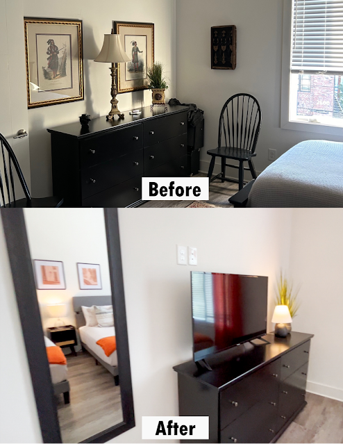
I am so excited to share these before & after images of a Nashville area Airbnb. This one-bedroom condo unit is located in a building specifically designed for short-term rentals and it was a blast to see it transformed into a cozy, comfortable, and Nashville-inspired space. 

The goals of this project were:

  • to gain additional seating and sleeping capacity
  • to improve the warmth & aesthetic appeal of the unit
  • to mix original & unique design elements with traditional Nashville style
  • to provide a place to dine and/or play board games

I cannot reveal the budget for this project, but trust me -- it was TIGHT! And the only items that remained from the original set-up was the sofa, dresser, and 2 pieces of art. 

With a very slim bankroll, I managed to take the full size beds to queen size in order to improve guests' sleeping comfort. A television, new bedding for both beds, curtains, and mirror were also added to the bedroom. And for a distinctive art element, original framed sketches of local park features were hung across the bed wall.  

In the living room, we added two faux leather barrel chairs to double the room's seating capacity. Then, a "renter-friendly" non-glass coffee table, floor lamps, a vintage industrial barrel used as a side table, wood art of the Nashville skyline, architectural mirrors, books about the area, a tic-tac-toe game, and a one-of-a-kind art canvas depicting the exterior of the condo were also added. But the owner's personal favorite upgrade is the electric fireplace which adds an undeniable warmth and ambiance that no other unit in the building offers.  

Finally, in the kitchen, banquette style seating with pillow backs was installed to maximize work & dining space. Topping it off is the pendant chandelier suspended by a pulley system above the table; giving the area an unexpected bit of industrial glam. 

Get a load of this glow-up . . . 


Friday, January 26, 2024

Our LR/DR Combo Era


I want to take a minute to show a side of my job that I don't often get to talk about -- design planning. While the bulk of my days are filled with helping clients ready their homes for the real estate market, I also help them create homes that they never want to leave.

This week I got the opportunity to help someone tackle a space that has been causing stress amongst homeowners for decades. You've certainly seen it. You may have even lived in such a space. I'm talking about the dreaded Living Room/Dining Room Combo; that anxiety inspiring zone that came standard in nearly every ranch-style home built between 1950 - 1980.

1960s Floor Plan with Living Room/Dining Room Combo
source: https://archive.org/details/WmEPedersenPracticalhomes10thed0001/page/n7/mode/2up

If the current fad of open concept has taught homeowners anything, it is that space planning is hard. But millennials have no idea how easy they have it with open concept homes. An open concept layout is essentially a blank canvas. You can pretty much put any furniture collection -- living, dining, office, etc. -- wherever you want. Throw a big rug down, put comfy furniture around it, and declare the area a family room. 

Back in the day though, we had to deal with the long, narrow, Living Room/Dining Room Combo. I doubt any studies have been done, but I'd lay good money on the likelihood that the reason Boomers are so grumpy is because they grew up in the rigid confines of the Living Room/Dining Room Combo Era. I don't know if Taylor Swift has gone through a LR/DR Combo Era, but I'm sure her parents did. It was an era that grabbed hold of builders nationwide and refused to let them go for 30 years. So it was no surprise to find that my client was struggling with space planning in her own LR/DR Combo. 

Even though I run into a LR/DR at least once a month (two so far this month), hers was especially difficult because it is unusually narrow -- only 11 feet. Compounding the situation, my client fell victim to the gigantic leather motion sofa monster. Not once, but TWICE! In an eleven foot wide space, my client placed two 39" deep sofas. The smallest of the two sofas completely spanned the only window in the room. What view the sofa didn't cover up, the curtains did. 


In fairness, the traditional method of decorating this room is, essentially, to line the perimeter of the room with furniture like the floor plan shown below. So my client did just as everyone has done with the room for decades -- she lined the room with her furniture. But as you can see that did not work out so well. 


When the ranch style home was popularized in the 50's, furniture was much smaller. It fit well in the narrow, alley-like spaces of the LR/DR Combo. But a lot has changed since then, especially furniture size. Now days, nearly everyone has a gigantic, over-stuffed, high backed, leather, motion sofa. That kind of seating may work great in an open concept home, but in a narrow 1960's ranch, it's just too much. 

So the challenge was to devise a plan that would provide seating for at least five people without overcrowding the room. It was also important to eliminate the bowling alley appearance and make it easier for people to comfortably see the television. The strategy had to include easy access to all points of entry, more/better lighting, complement the adjoining dining area, inject elements of style, and convey a feeling of spaciousness. 

Drum roll please . . . 


Now, I am NOT a fan of sectionals. In fact, my hatred of the sectional sofa has been well documented here before; but in short, I don't care for them because most people don't know how or when to use them. They put sectionals in spaces that are simply too small for them. I also dislike sectionals because they claim to offer more seating than they actually do. The sofa depicted in these renderings boasts seating for six. I call BS! Yes, you can put 6 butts in the seat of that sofa, but 12 knees are a different story. Six adults cannot sit on that sofa without their knees touching. 

In this case though, a sectional was the best option for achieving our objectives. I retained the 5 seating spots that the original leather sofa group provided, plus I picked up a sixth seat in the swivel chair located near the door. The swivel chair is a particularly important element in this floor plan as it is compact, it is rounded to provide easy access in a tight space, and it allows the user to converse with people on the sofa and then back to the TV to watch the Vols score!


Another essential ingredient of this space plan is the round cocktail table. Like with the chair, the round table provides easier passage around the seating groups. When working with small spaces, every inch counts. 


I was able to capture even more seating by placing two round upholstered stools beneath the console. When not in use, they tuck easily back under the table.  

To improve lighting, I first opened the curtains so they flank the window and allow much needed daylight into the dark room. Roman shades are hung behind the panels and can be lowered for privacy at night. The 3 stacked mirrors also offer a reflective element to the room. Near the window, a pharmacy lamp was added for lighting beside the chair. Its small stature allows for easy conversation with the sofa group and does not block the window view. A surprise light element was gained via a rechargeable picture light above the art hanging beside the television.  Finally, a tripod lamp serves as both an art element and a height provider to balance the mirrors on the right side of the room.

In the dining room, the client requested a "mudroom" style bench to be placed to the right of the back door. The Roman shades were repeated on the windows in the dining area, but no curtain panels. This gives the room a sleek, clean look. Then new table, chairs, and cabinet in warm wood tones and rug complement the adjoining family room. 


So what do you think? Do these design plans accomplish all the objectives to help the client live spaciously and stylishly in her LR/DR Combo Era? 


Monday, April 10, 2023

Empty Nesting


It's been a minute or . . . six (years) . . . since I took the time to write about my projects. The housing market in Nashville has been unbelievable in the time since I last updated y'all. Things were selling before they even made it to market. Houses that I wouldn't have given a plug nickel for were selling for above market value. It's been nuts. 

Now that things have calmed just a bit, I wanted to hop on and show you some photos of a recent renovation project on a 1990s era home. The kids have moved out and the parents felt it was time for a change. There was no massive construction undertaken in this project, only cosmetic updates. But boy are the results dramatic. 

For starters, the carpet throughout the home was removed and new hardwood was laid to match existing hardwoods. And when I tell you there was a LOT of carpet to remove, I'm not exaggerating. There was even carpet in the bathrooms. 😲

Fresh paint, window treatments, and new accent furniture pieces also helped to bring the home into this century. Take a look at these before & afters


The primary bedroom before was okay. It was neat, clean, and all that, but it lacked luxury and a cohesive look. So everything but the bed/bedding and those great lamps were given the boot. Dove grey and powder blue accent colors were introduced to the color palette and a pair of matching, chunky chests to flank the bed helped to make the room look properly filled out. Then new linen drapes, beveled mirrors, a soft rug, and art completed the transformation. Notice how much just changing the lampshades affected their appearance. It's always the little things.

One of the secondary bedrooms had been changed to an office a few years prior to the renovation, but like the primary bedroom, it left a lot to be desired. Old carpet, gold-ish paint from the early 2000's, and just a general "catch all" appearance certainly didn't evoke a feeling of productivity. So the carpet was ripped out, a new desk purchased, new Roman shade was made, new rug, updated lamps, and subtle navy & orange accents were added for the Auburn grad who resides there. 

Look closely at the art. See those little bits of orange that are near exact matches to the lamps? That's no accident. Let me show you how we pulled that off . . . 


The abstract art was purchased without any orange -- as you can see in the photo on the left. A quick trip to Michaels for orange spray paint (for lamps) and matching acrylic paint for the canvases and a custom look was easily achieved. The materials to create coordinated accessories cost about $15 and only took about an hour total. I'd say that was a great deal. Again, it's all in the little details.

The other upper bedroom was the biggest transformation, in my opinion. The "before" of this room is not the original "before". This room actually got a new coat of paint when the owners moved in because there was a 3 foot hydrangea mural/border painted around the base of the room. There are no pics of that because everyone has agreed to just forget it ever existed. But this room was painted in Tiffany Blue & brown shortly after the family moved in, because that's what every little girl wanted in 2008. And the room has remained largely unchanged since that time. 

Like the other rooms, carpet was removed, new paint on the walls, and new furniture was added. The most beautiful fabric -- Covington's "Joybird" in the Dove colorway -- served as inspiration for the room's decor. We put it on the upholstered headboard and made a new Roman shade from it. Here's what it looks like up close:


Finally, I want to show you my favorite part of the update -- the Jack & Jill bathroom. I warned you from the beginning that the baths had carpet which was definitely the worst aspect of this area, but coming in a close second as the worst thing about this bathroom was all the doors. 

BEFORE

AFTER

BEFORE


AFTER

It's natural to have a lot of doors in a Jack & Jill bath, but usually the number is around 4 -- one entry door from each room and then a door on each side of the shared area. But this Jack & Jill set up had SIX. In each sink/toilet area there was also a large linen closet with bi-fold doors. Had the sink/toilet area been large, the doors to the linen closet probably wouldn't have been an issue but the area between the vanity/sink and closet is not even 3 feet. Plus, when the entry door is open, it presses up against the linen closet. It is impossible to open the linen closet without closing the bathroom door. A better design choice would have been to just make the bath larger and ditch the closet; but the builder didn't ask me. 

Anyhoo -- the linen closet was useless and made getting ready quite uncomfortable. As much as it should be removed, this was a no-construction renovation. So the space remained . . sort of. We took off the doors and added a dressing table, complete with electrical outlets for hair dryers & curling irons, lighting, and new mirror. What a difference!


Here are a few more, larger After shots of the results. The photos just don't do the changes justice, but I hope you can agree it was a beautiful improvement. 


Sunday, July 16, 2017

Cottage Charm

Neighborhoods in close proximity to downtown are all the rage among Nashville buyers these days. Nowhere is that trend more evident than in East Nashville. Buyers from all walks of life are gobbling up the area's bonny bungalows as quickly as a For Sale sign can be planted in the ground.

My blog posts have been pretty much nonexistent this year because I've been very busy consulting on and staging many of these charming cottages; including this one that sits in walking distance of two of my favorite restaurants in Nashville -- Holland House & The Pharmacy. Here's a peek:


Of course, not all listings in Nashville's transitional neighborhoods have been upgraded and are "move-in ready" like this one. In fact, most are not. More commonly we find either a home where the owners had good intentions but neither the time, energy, nor budget to bring it into this decade -- OR -- we get longtime owners who are elderly and the home has hardly changed since the day they moved in.

That's sort of the situation with our most recent project. The sweet family recently lost their father and are moving their mother to a small condo where they can care for her more easily. After removing the furnishings that their mother wanted to keep, the family had an estate sale and pretty much cleared out the home. Here's how it looked when we arrived . . .

Living Room -- Before

Kitchen & Breakfast Room -- Before

 Bath -- Before
As you can see, it's pretty dated. This listing, however, is in an area where real estate investors are hungry for homes with character and curb appeal; which this house has in abundance. And knowing that many buyers want to renovate while still living in the home, it was important to show off this basement bungalow's move-in ready condition. So this project's aim was to restore the charm of this 1940's cottage with contemporary style. Here's what we did . . . 

Living Room -- After

Living Room -- After

Kitchen -- After

Bath -- After
Going with light & neutral furnishings and creamy accent pieces, we helped the space to look bright, fresh, and most importantly, updated. Now, potential buyers can see that this home can easily be lived in while renovations take place. A move-in ready home full of charm -- it's an absolute win for buyers! 


Wednesday, December 7, 2016

Simple Solutions for an Instant Style Boost

I'm beaming with pride. Nothing makes a designer happier than having a client take your advice. Not long ago I met with a client whose home had been for sale during a hot market, but had received very little attention from buyers. The house was newer, well-kept, and in a great location. So its failure to receive an offer was perplexing to her and the agent. After visiting the home, it didn't take long to identify three big issues that were making it hard for buyers to love the home.

1. Paint. Several rooms were painted in very saturated and muddy earth tones. With the current trend being light palettes and greige tones, this home seemed out of style.

2. Haphazard Design. Low lighting, disorganized & visible electrical cords, and a lack of balance in major rooms gave the home a sloppy appearance.

3. Mediocre Master. The master suite is one of the most important rooms in a home to buyers. Underwhelming details in this master suite left potential buyers disappointed and wanting to look elsewhere.

To remedy these problems, the homeowner was advised to: Paint, fix issues of bad scale, improve lighting, remove clutter, and boost elements of style -- especially in the master.

Take a look at the Before & After photos . . .

Living BEFORE
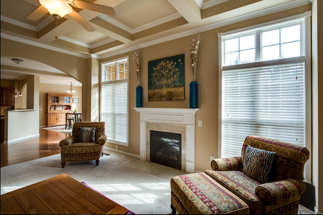
Before -- The room was a muddy, greenish-brown hue. Feedback on the color selection from potential buyers was not positive. The heavy color, particularly on the coffered ceiling, made the room feel heavy and drab. Compounding the issue were furnishings lining the perimeter of the space, making the room seem very short.


Living AFTER
After -- The room is lighter and brighter. The new paint color on the coffered ceiling helped to visually raise the height and virtual space of the room. 


Living BEFORE
Before -- The small TV on the mantle, again, made the room seem visually short. The scale was just not good. Plus, cords hanging from the mantle along with the cable box perched on a stand made for a very untidy and chaotic appearance. As a result the clutter and disorganization cheapened marble finishes and architectural elements. 


Living AFTER
After -- The large art and accessories help to give the room a polished, coordinated look in keeping with the home's grand architectural features. 


Dining BEFORE
Before -- The dining room's muddy color and lack of personality failed to impress.


Dining AFTER
After -- The dining room's lighter color, well-proportioned art, tasteful centerpiece, and oriental rug soften the room and add touches of simple charm.


Master BEFORE
Before -- The master suite was drab and sloppy. It was just not the stylish retreat that today's buyers desire.


Master AFTER
After -- Bedside tables, large matching lamps, coordinated bedding, and a large architectural art piece as a headboard added instant style and luxury that this suite lacked.

It turned out really amazing and is sure to wow buyers!

If your home is sitting on the market with little interest OR if you love your home, but are just tired of your current look -- it may be time to think about making some quick, easy, and inexpensive changes. Paint, updating fixtures, coordinating bedding, and improving lighting are the easiest and most economical ways to give your home an impressive, coordinated, and polished look.