1. Paint. Several rooms were painted in very saturated and muddy earth tones. With the current trend being light palettes and greige tones, this home seemed out of style.
2. Haphazard Design. Low lighting, disorganized & visible electrical cords, and a lack of balance in major rooms gave the home a sloppy appearance.
3. Mediocre Master. The master suite is one of the most important rooms in a home to buyers. Underwhelming details in this master suite left potential buyers disappointed and wanting to look elsewhere.
To remedy these problems, the homeowner was advised to: Paint, fix issues of bad scale, improve lighting, remove clutter, and boost elements of style -- especially in the master.
Take a look at the Before & After photos . . .
 |
| Living BEFORE |
Before -- The room was a muddy, greenish-brown hue. Feedback on the color selection from potential buyers was not positive. The heavy color, particularly on the coffered ceiling, made the room feel heavy and drab. Compounding the issue were furnishings lining the perimeter of the space, making the room seem very short.
 |
| Living AFTER |
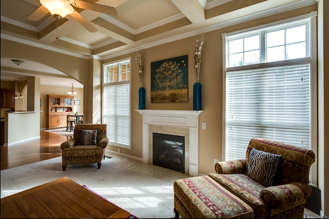
After -- The room is lighter and brighter. The new paint color on the coffered ceiling helped to visually raise the height and virtual space of the room.
 |
| Living BEFORE |
Before -- The small TV on the mantle, again, made the room seem visually short. The scale was just not good. Plus, cords hanging from the mantle along with the cable box perched on a stand made for a very untidy and chaotic appearance. As a result the clutter and disorganization cheapened marble finishes and architectural elements.
 |
| Living AFTER |
After -- The large art and accessories help to give the room a polished, coordinated look in keeping with the home's grand architectural features.
 |
| Dining BEFORE |
Before -- The dining room's muddy color and lack of personality failed to impress.
 |
| Dining AFTER |
After -- The dining room's lighter color, well-proportioned art, tasteful centerpiece, and oriental rug soften the room and add touches of simple charm.
 |
| Master BEFORE |
Before -- The master suite was drab and sloppy. It was just not the stylish retreat that today's buyers desire.
 |
| Master AFTER |
It turned out really amazing and is sure to wow buyers!
If your home is sitting on the market with little interest OR if you love your home, but are just tired of your current look -- it may be time to think about making some quick, easy, and inexpensive changes. Paint, updating fixtures, coordinating bedding, and improving lighting are the easiest and most economical ways to give your home an impressive, coordinated, and polished look.


No comments:
Post a Comment
Thanks for visiting Bradford House Consulting's blog. We appreciate your thoughts and comments.