Thursday, March 20, 2014

Bring It On!

It happened again! Another client called needing our help with a vacant home. Only this time, the home isn't really what I'd call vacant. In fact, I can think of plenty descriptive terms for it, but vacant isn't one. I guess I'd call this home a challenge, but that's not quite right either. It's more like -- Our Biggest Challenge Ever!
 
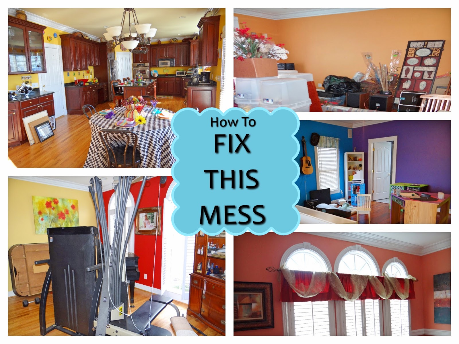
So here's the deal: The owners built another home nearby and moved into it months ago. Their new home is completely furnished and decorated. All the stuff remaining in this "vacant" home is what they didn't need or want in the new home. Some rooms are just as they were the day the family moved out, others are full of boxes and unwanted items.
Our challenge
The challenge was to take all that stuff - a hodgepodge of unbelievably bright colors, mismatched furniture, and unusual accessories -- and turn it into a look befitting a million dollar lakefront listing. Did I mention that we had to do so without painting a single wall or adding any staging accessories whatsoever?  We said - BRING IT ON!
 
Our first room to tackle was the kitchen. Essentially, it remained in exactly the same condition as the day they moved out. With uber bright yellow walls and massive amounts of kitsch tacked to every surface, the look just wasn't working. So we removed nearly everything. Then we staged it with only simple, solid colored, and neutral items to counterbalance the strong wall color.


One more thing about the kitchen & breakfast area that I must mention is the tablecloth. Wow! It's something, isn't it? Normally we'd just remove it and move on to the next thing, but in this case that solution wasn't possible. The owners took the kitchen table with them when they left. What you see now is their somewhat clever attempt to disguise a folding table as a kitchen table.
 
Like I said, our initial thought was to just remove the hotspot altogether, but without the table beneath, the low-hanging chandelier would be a hazard to prospective buyers touring the property. The table had to remain. We scoured every inch of the home seeking an alternative to the harsh harlequin pattern on the tablecloth. The best we could do to neutralize it was to throw a solid café square over it. It's not ideal, but it is certainly easier on the eyes.
 
Like the kitchen, the living room presented similar issues -- bright colors & lots of knick knacks. We also had to cope with clutter and furniture placement problems. The room itself was also a challenge. Essentially we had a big room, big furniture, but very little wall space. Floating the large sofa between the columns or facing the windows was considered, but we ultimately decided against that option because showing off the space was top priority. In the end, we positioned the recliner near the sofa, offering buyers a fully open living area. Take a look . . .


The dining room was my favorite transformation of the day. First we removed the all of the clutter blocking the entrance to the room and that heavy, light-thieving valance. Next we separated and moved the oddly paired bookcase ends that were hiding the alcove. From there we moved on to decluttering and editing accessories. We also placed all the chairs around the table to eliminate the number of items scattered about the room. But what made the room spring to life was adding that gorgeous piece of statement art under the recessed spotlights in the alcove. The result is amazing!


In this bath, we were once again faced with the unchangeable yellow wall color. Actually the color can be great when the art and accessories work in its favor, but when accessories are in such an abundance that your eyes dart back and forth from accessory to color, it can overwhelm the senses. To make a really saturated wall color work, it is best to let the color be the accessory. Keep everything else soft and simple.


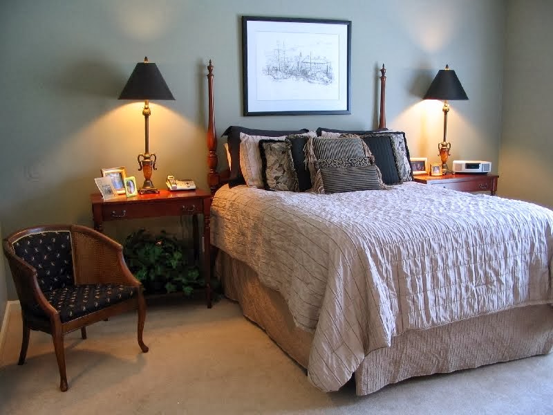
The master bedroom and bath was another of my favorite changes of this project. When we arrived the master suite was a narrow alleyway chopped in half by a dated, and very odd fireplace. Leaving the room empty was NOT an option because you CANT. STOP. STARING. AT. THE. FIREPLACE.
 
Near the master suite we noticed a very small bedroom that was crammed full of furniture. We decided that it would be far better for a small bedroom to sit empty than the master suite. So we borrowed from the small bedroom to show off the potential of the master.
 
Take a look at the Master Suite transformation sponsored by a neighboring bedroom . . .


Just as we did in other rooms, we addressed the issue of bright paint and kitsch in the master bath by decluttering, editing, and adding some powerful & coordinated art. The changes make for a much more pleasing appearance.


Monday, February 24, 2014

Size Does Matter

I am horrible at capturing Before & After photos of our projects and today's post is further proof of that fact. Despite my difficulties with obtaining gorgeous Before & After photos, I thought you'd enjoy a glimpse at one of our recent projects illustrating how much size really matters.

The subject of these Before & Afters is a home that was previously on the market, but did not sell. The home is fabulous. It's large, fairly new all-brick construction, located in a gorgeous golf community, and has tons of potential. The agent and homeowner were understandably stumped as to why it sat on the market, so our first order of business was to figure out what factors prohibited a sale last time.

It wasn't amenities, size, cleanliness, nor location that kept a sold sign from the yard. This home has all of those qualities in spades. What struck us was that the home was not showing as spectacularly as buyers in that price point expect. In general, the home lacked a "WOW!" factor.

Here is what we had to work with . . .

Living Room - BEFORE   (Source: Bradford House Consulting)
In the Before photo of the living room, you can really see the size and scale of the room. Just look at those windows. They're amazing! Did you notice anything else in the room? Not really, right? Everything else is kind of underwhelming. The room is crying out for more light, more art, and much larger accessories.

Living Room - BEFORE   (Source: Bradford House Consulting)
Here's another angle. Again, everything is undersized -- the rug, ottoman, the topiaries on the hearth, and the tiny little flowers on the mantle. Over by the window, that little tray table is practically invisible because of its petite size and washed-out finish. And what about those bright red throws and pillows? They do nothing to complement the rest of the furnishings.

Now -- here's where I prove to you the true horribleness of my abilities to capture great Before & After photos. I forgot to bring my camera the night we staged this house, so the "After" photos you see were either taken with my phone or pulled from the realtors' website. C'est la vie!

Living Room - AFTER  (Source: Bradford House Consulting)
Despite the blurry phone photo, you can see we pumped up the size of accessories to match the scale of the room. The small black & white framed photos were removed from the sofa table and replaced with a large sailboat (about 30" tall) and the topiaries from the hearth. Two apothocary floor lamps were placed beside the sofa for additional light. And if you look closely, you can see that a larger rug was also added. See how it's edges are wider than the sofa? Using a bigger rug and pushing the furniture out from the center of the room instantly made the room seem larger.

Living Room - AFTER   (Source: RealTracs.com)
From a different angle you can see we changed out the harsh burgundy accents. Pops of color now come from soft blues, greens, and creamy yellows on the pillows and throws, as well as a the coffee table trunk. We also dressed up the built-ins with larger accessories and lamps. Then we added bigger topiary frames to the hearth and removed the unnecessary little flowers from the mantle. Finally, we brought in a big round table to sit between the two accent chairs; topped off with a huge lamp and chunky accessories. Everything we added was bigger!

Most importantly though, we increased the rug size, pushed the furniture out JUST FOUR INCHES, and swapped the accent chairs so that the light colored chaise was no longer lost against the white built in shelves. By fixing the scale and light issue in this main room, we increased the overall grandeur of the home. Remember -- just four inches is all we moved the sofa and chairs out from the center of the room.

In the dining room we ran into similar issues of scale and color. Notice how the dark square table and bright red chairs fight with the pale, beachy tones of the home. Plus, the small art arrangement on the wall did nothing but accentuate the poor scale. The small grouping was swallowed up by the big space and hidden by the chandelier.


Dining Room - BEFORE   (Source: Bradford House Consulting)
 
To remedy the issues of scale, we added two chairs to the table. Although the table is square and not really suited for the shape of the room, we fooled the eye with the additional chairs and then we pulled the end chairs out just a bit-- about FOUR INCHES. Suddenly it looked as though we had a long, rectangular table that fit the size of the large room.

We also replaced the small grouping of shell pictures with a very large mirror. By doing so, we dramatically improved the room's scale and lighting.

Dining Room - AFTER    (Source: Realtracs.com)
To combat the problem of harsh, space-consuming color, we had the homeowner cover the parsons chairs with simple linen slipcovers. Then we removed the busy table scape; replacing it with a simple runner and a pair of lanterns. Now the space shows in a very open and well-coordinated fashion.


Another room that I'm particularly proud of when I look at the Before & Afters of this home is the Master Bedroom. In the Before photo, the room seems smallish and bland -- it lacked pizazz and drama. It also suffered from poor scale. The bed and side tables are extremely large; barely fitting the space. Adding to the scale troubles is that the lamps were really small, the pillows didn't fit the bed properly, and the art was hung about FOUR INCHES too low. The overall look just was not working.

Master Bedroom - BEFORE   (Source: Bradford House Consulting)

Take a look at it now. . .

Master Bedroom - AFTER   (Souce: Realtracs.com)
The room looks larger and less crammed, yet we did not move one stick of furniture. Instead, we increased the feeling of space by making use of the room's incredible height. Just as we did in the living room, we added accessories to complement the tall ceilings and windows.

We started with two silver-leafed mirrors hung above the large bedside chests. Not only did they add to the feeling of space, but they added much needed drama. Next, we added some bling with a large pair of mercury glass lamps with linen shades to the center of the tables. We softened the chaos of the bedding set by using a light blue coverlet and folding the busy quilt back as a small accent. Then we added king-sized pillows to properly complete the bedding ensemble.

Finally, we hung the art at the appropriate height. Do those four pictures look familiar? They are the framed shell sketches from the dining room. They really work well in this room.

We tell people all the time -- fix the scale and fix the lighting. Those issues are key to whether or not your home shows in grand fashion; regardless of its size. I hope from my pitiful attempt at Before & After photos you can get a sense of how much scale and lighting really affect your home's "Wow! factor." Moving or increasing the size of an item as little as FOUR INCHES can make a dramatic difference in the way your home appears to others. More than anything, I hope I've proven to you that size does matter!

Friday, January 10, 2014

Let There Be Light!

Whether you're a believer or not, pretty much everyone knows the story of God creating the heavens and earth. And that on the first day, God's very first order of business was to turn on the lights.

"And God said, “Let there be light,” and there was light.
God saw that the light was good . . ." (Genesis 1:3-4)

I happen to be a believer.  But even if I weren't, I'd still be convinced that Light Is Good -- particularly when it comes to selling a house.

Over the summer we were asked to consult on a home that had been on the market several months. It had been shown 35 times without so much as a nibble. The agent and client could not understand why the home had been on the market so long. And after viewing the online photos, we couldn't see the problem either. It was a fairly new home, all brick, great neighborhood, excellent schools, clean, neat, etc. It wasn't over-priced or strangely decorated. It was a truly great home.

The agent and owner theorized that the lack of granite in the kitchen was prohibiting offers, but we suspected the problem was something that we could not see in the online photos. Bad neighbors, cats, a smoker in the home -- you know, one of those things you hate to tell clients. 

We arrived fully expecting to be assaulted by the stench of cat pee, but there was nothing like that to be found. No eyesores next door, no smokers, nothing. The house was as clean and neat as the photos depicted. We were stumped.

We went room-to-room making minor furniture placement suggestions, but there were just no red flags. The only constant was that we kept saying, "You need more light in here." After about the fourth or fifth room, I asked the owner, "Is this how you show the home? Are the lights on or off when buyers visit?"  Well guess what...the lights were off and the blinds closed! Every time a potential buyer entered the home it was like they were stepping into a dungeon.

You could have knocked the agent over with a feather. I watched her mouth literally fall open, aghast at the fact that her client had been showing the home all summer without a single light on anywhere.

There is a reason why the winter causes people to be down and depressed. The grey and gloomy skies and cold temperatures cause a real condition known as SEASONAL AFFECTIVE DISORDER. It's no different when your home is shut off from light. A lack of light depresses buyers and prevents offers. Because of the lack of light throughout the home, buyers visiting our client's dreary home were essentially hit with temporary seasonal affective disorder.

In the case of our "in the dark" client, we told her to add lamps to every room and turn them on whenever the home was shown. She did and the house sold within a week.

If you're still skeptical, just take a look a the difference lights can make to the overall aesthetic of a room.

No lights, Blinds closed
See how blah that room looks with no lights on and the blinds closed? It's completely cold and dark. Nothing about that makes me want to go in and enjoy the space. Totally uninviting.


Lights on, Blinds open

Here's the same room with the lights on and blinds open. It's brighter, warmer and the beauty of the room shows. You see details in the accessories and the space of the room seems larger.

Lighting can really make a difference in your online photos too. The pictures above are totally amateurish (meaning they were taken by me). A professional photographer is trained how to use lighting to achieve the most beautiful photo possible. It's no secret. Lighting can make or break a first impression -- even online.

So if you do nothing else to prepare to sell your home, PLEASE....let there be light!

Friday, November 29, 2013

Trees, Turkeys, & Twin-size Sheets

Yesterday we hosted the whole family for Thanksgiving dinner. As most anyone who has ever hosted the meal of the year will tell you, there's a ton of prep work required before the first dish hits the table. Chief among the list of to-do's is cleaning. I keep my home fairly clean every day. But when it comes to special occasions, I always want to make things sparkle.

So before we fried three turkeys, baked two dishes of cornbread dressing, and one giant pan of homemade mac & cheese to go with all the other fixings, my husband and I cleaned the house from top to bottom. Steaming carpets, wiping baseboards, washing windows; we had enough stuff on our list to keep us busy for five full days. Despite our long list of chores, with less than 24 hours to Turkey Time, I decided to give our bedroom a mini-makeover.

I'm really terrible about remembering to take "Before" pictures of my own stuff. I always remember when we work with clients, but when it comes to my own projects I regularly drop the ball. Such is the case with my latest project. I had to wade through some really old photos to give you an idea what things looked like before we made changes on Wednesday.

Biggest Bradford pear trees ever!
The first "Before" picture shows the real impetus for this project. You see those giant Bradford pear trees? I had a hate-love relationship with those trees for many years. I hated the way they blocked the view of our home. And I hated the way that no matter how often we pruned them, whenever the slightest wind blew, a branch would usually fall off. Eventually strong winds relieved us of the hassle of regular prunings by taking them both completely down. That's when I discovered that I actually loved those trees because whenever the moon was full, they kept the piercing 3 AM moonlight from shining right into my eyes.

So let's take a look at my bedroom -- or at least what my bedroom looked like a few years ago.

BEFORE - celery green walls, ornate bedding, sad little chair.
A year or so after the previous picture was made, we upgraded to a king-sized bed which required a new headboard, bedding, etc. I showed a glimpse of the new bed when I discussed how to properly make a bed. Here's how it looked just a few days ago . . .

King size bed w/dark frame & microfiber upholstered headboard
Now to the "AFTER" photos . . . Before you take a look, I need to reiterate that this is a mini-makeover. There is still plenty of changes to come like new lamps, art, and more. For now though, here's a look at phase one -- all accomplished on the Wednesday night before Thanksgiving.

Bedroom AFTER (Phase I)
First, we got rid of those celery green walls (Okay, I didn't do this step on Wednesday. That was done a few months ago). Next we painted, glazed, and distressed the headboard. Then we reupholstered it with a simple grey on white plaid fabric.

After upholstering the headboard, I had a little bit of fabric left. In fact, it was just enough to cover that sad little bedside chair. Looks a lot better now, huh?

Then the obvious change of adding simple, white bedding. So simple, but so impactful.

Then we attacked the primary problem of my bedroom -- covering that arched window that lets the full moon blind us on a monthly basis. Our ceilings are pretty tall (10 ft), so we needed extra long curtains. With the crown molding, we needed 110" panels to be exact. The problem though is that with less than 24 hours, finding ready-made 110" panels is next to impossible. So we opted for a pair of XL Twin-size flat bed sheets hung from cafe clips. And when the moon is full, you can bet we'll slide those bad boys across that arch and sleep like babies for the first time since the trees fell.


I'm really thankful that Grady approves of the changes. Nothing is worse than a grumpy schnauzer during the holidays!

Wednesday, June 12, 2013

Don't Pack Up The Personality

The first rule of preparing a home for sale is to DECLUTTER! I've said it here about a million times and I'm pretty confident that you've heard it elsewhere too. That's because along with deep cleaning, the best thing you can do to get your home ready to sell is to clear out the clutter. Unfortunately, some of you don't know when to stop.

When I tell you we deal in extremes, I am not kidding. Clients don't often ask for our help with neat, functional, and well-styled homes. When we get a call, it's usually to help cull a home owner who has gone too far; either by creating a hoarder's haven or decluttering themselves into total starkness.

Last week we helped out with a home that was full of extremes. For starters, the furniture was huge and the home wasn't. Although we don't typically label furniture as "clutter," the scale was such that it simply swallowed the space. Rooms appeared cluttered even though they were not. So we had to "declutter" the furniture to show off the true size of the rooms.

The biggest challenge we faced though, was that the home had been over-decluttered. In preparation for our arrival, the family had removed EVERYTHING except the furniture. They stored all pictures, art, accessories, and bedding -- all the things that make a home feel like a home. In an effort to declutter, they actually packed up the personality and the result was disastrous.

Living Room - BEFORE
Here you can see the living room as it was when we arrived. The furniture overwhelmed the space, hid the interesting shape and architecture of the room, and created a traffic flow nightmare. You cannot tell from the photo, but just behind the sofa is a wall and part of the kitchen counter. There was hardly any room to walk between the sofa and the wall/counter.

The other problem was that the room had no accessories or art of any kind to charm buyers. It was dull, unimpressive and B-O-R-I-N-G.  But look at it now; so much more spacious and inviting. To get this result, we merely removed one of the bulky end tables and that gargantuan entertainment unit. Then we moved the couch away from the wall and counter and shifted the chair to the other side of the room. But what brought the room to life was the addition of a few simple accessories.

Living Room - AFTER
Here's another angle. . . .
 
Living Room - BEFORE
And after . . .

Living Room - AFTER

 
In the bonus room, we thankfully didn't have to deal with removing huge pieces of furniture. Instead we found a long, empty, lackluster room. Once again, the personality had been packed away.

Bonus Room - BEFORE

Fortunately, we had some extra furniture on hand thanks to a mammoth workstation from the dining room. It worked so much better separated into two units in the bonus room. With a few pieces of art, a television, and a rug, buyers can now envision the room as real bonus.

Bonus Room - AFTER


Even injecting a little personality into often forgotten spaces like a powder room can offer big rewards. See how Plain Jane the powder room looked when we arrived . . .
 
Powder Room - BEFORE
Just adding two simple framed pictures, removing cleaning items, and closing the toilet lid made a substantial impact on the appeal of this bath.
 
Powder Room - AFTER
 
Bottom line: Decluttering is imperative to preparing your home for the real estate market. Just be sure that you don't declutter so much that you sacrifice your home's personality and appeal. Buyers need to be wooed. They have to fall in love with a home before they make an offer. Art, accessories, proper furniture scale and placement are the keys to getting a buyer say "I do."
 
We pumped up this home's personality with art and accessories and put the furniture on a diet. And by doing so, within two days the agent had received two full-price offers.